US Bank Extended Onboarding Console
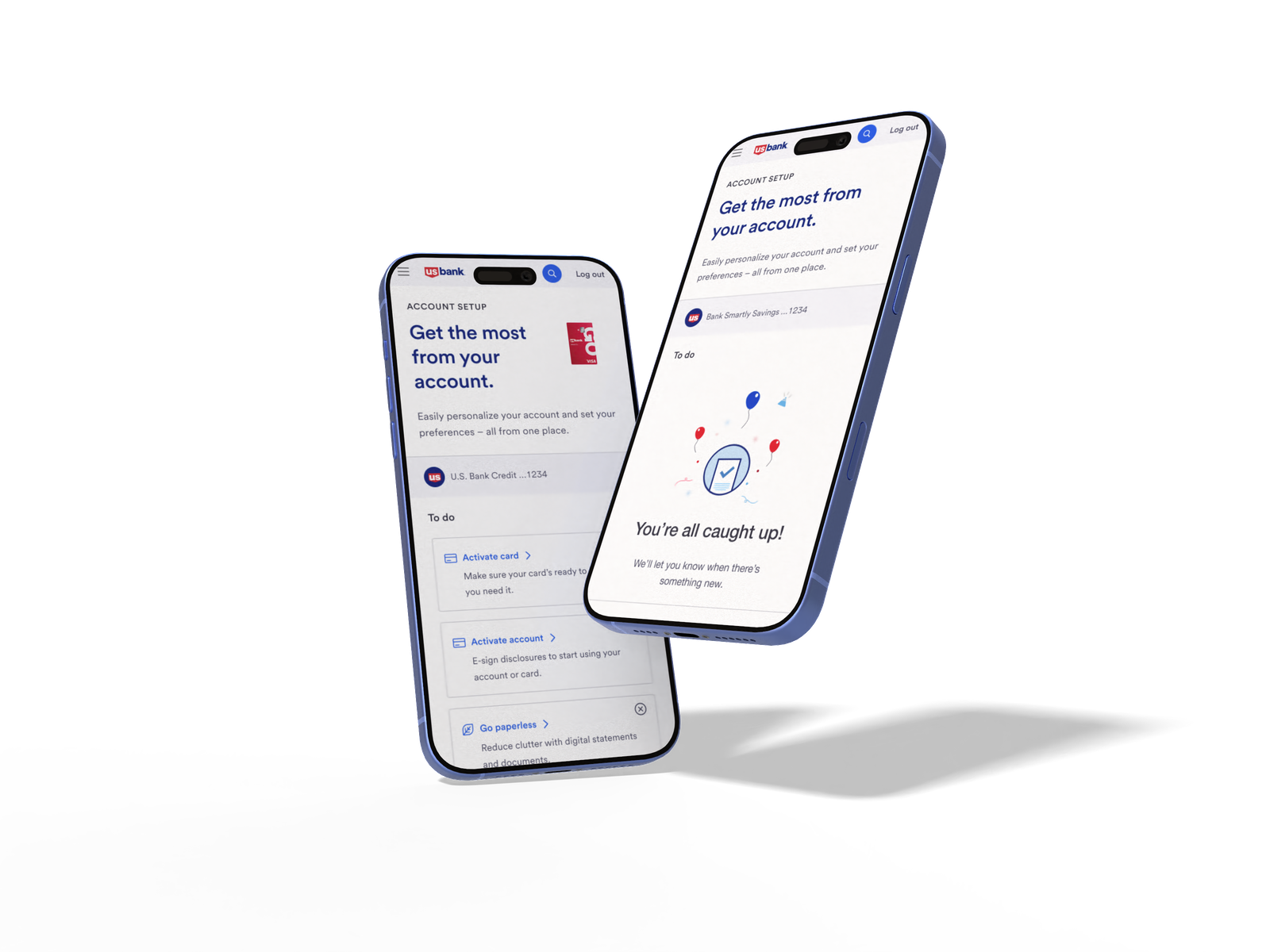
A persistent reentry system that brought 19% of dismissed customers back to complete their account setup, and lifted feature adoption by 10% in the first 90 days.
01 / Challenge
Designing Extended Onboarding: Supporting Continuity and Completion
Overview
Extended onboarding picks up where first login leaves off. It pulls users back to the dashboard and gives them one place to finish what they didn't get to the first time around, on their own schedule, without the pressure of a single sit-down setup.
Problem
If users skipped setup at first login (or only got partway through it), they had no obvious way back. The tasks just disappeared.
Why it matters
Without a way to come back, onboarding fell apart. Accounts stayed half-set-up and key features went untouched.
System context
This is the second half of the onboarding story. Instead of asking users to do everything in one sitting, it lets them finish setup gradually, when it actually fits their day.
System overview
- ▪Dashboard widget, the re-engagement entry point
- ▪Onboarding console, the task completion hub
Key insight
The hard part wasn't getting users through the tasks, it was getting them back to the tasks at all. They needed a reason to return and a clean place to land when they did.
Tension
It had to nudge people without nagging them, and surface multiple tasks without dumping everything on them at once.
Constraints
Whatever I built had to live inside the dashboard we already had, and play nice with the existing onboarding rules.
My role
Owned design end to end for the extended onboarding console, from prototyping through research and engineering handoff. Set the direction to split the experience into a re-engagement entry point and a task completion hub, and pushed back on shortcuts that would have weakened user trust or the spacing system during build. Partnered with an XA who facilitated stakeholder alignment and decisions, a content strategist, and UX research support throughout.
Approach
Entry Point (Widget)
- ▪Surfaces incomplete tasks
- ▪Encourages reengagement
- ▪Directs users back into onboarding
Onboarding Console
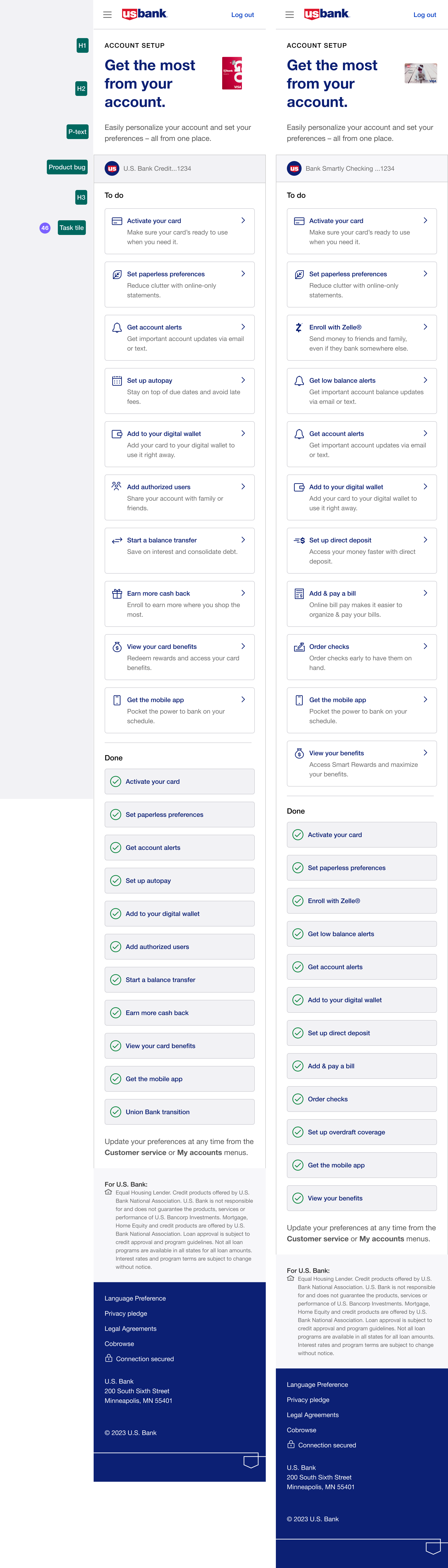
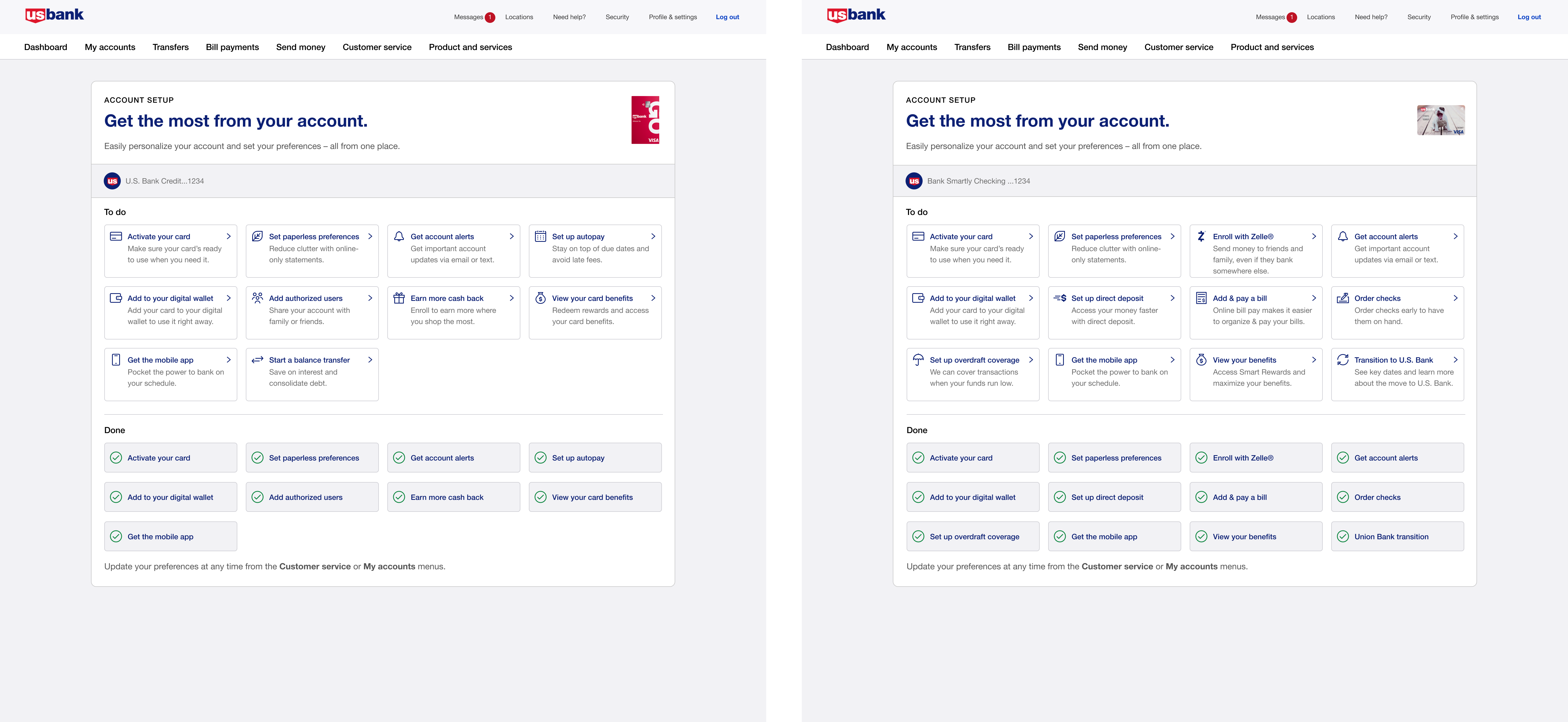
- ▪Centralizes remaining tasks
- ▪Provides structure and clarity
- ▪Supports guided task completion
Outcome
Shipped a connected onboarding system that gives users a way back in, makes it clear what's left, and lets them finish at their own pace.
Part of a connected system
This experience builds on First Login Onboarding, where users are initially introduced to onboarding tasks.
02 / Impact
Reducing dropoff through persistent reentry and structured task completion.
A Reminder (Dashboard Widget) and a Console (Onboarding Console) gave people a low-pressure way to finish setting up their account on their own time. The results showed it worked.
+10%
Feature Adoption
More customers completed extended setup tasks like Alerts, Paperless, Overdraft, and Autopay within their first 90 days compared to the previous experience.
+15%
Discoverability
Users found and navigated to key digital services noticeably faster. Having the widget on the dashboard made a real difference in how people explored their account.
+19%
Console Return Rate
Customers who dismissed the first login flow returned to complete setup tasks via the dashboard widget, a behavior that didn't exist before the console launched.
03 / Solution
A 3-component system that drove +10% feature adoption and +15% discoverability within 90 days.
The solution was a system of three connected pieces: a Prompt (Interstitial Microflow) on first login, a Reminder (Dashboard Widget) that stays visible for 90 days, and a Hub (Onboarding Console) where customers can pick up right where they left off.
One-time interstitial only
Login, see the modal once, close it, never find it again
Prompt → Reminder → Hub
Log in, see the widget, jump into the console whenever it feels right
Widget Entry Point
Console
Final Design
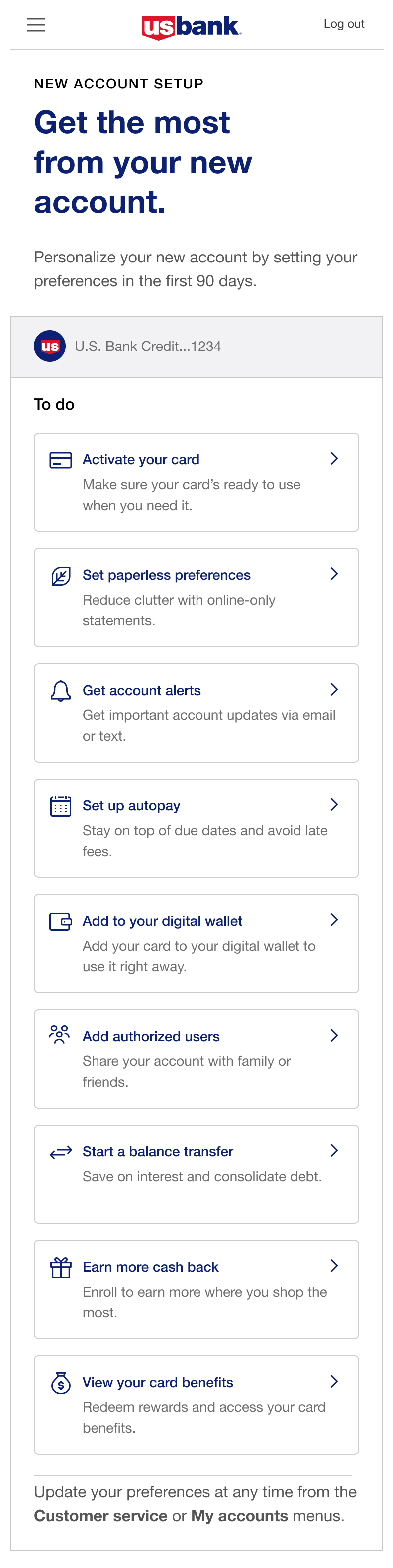
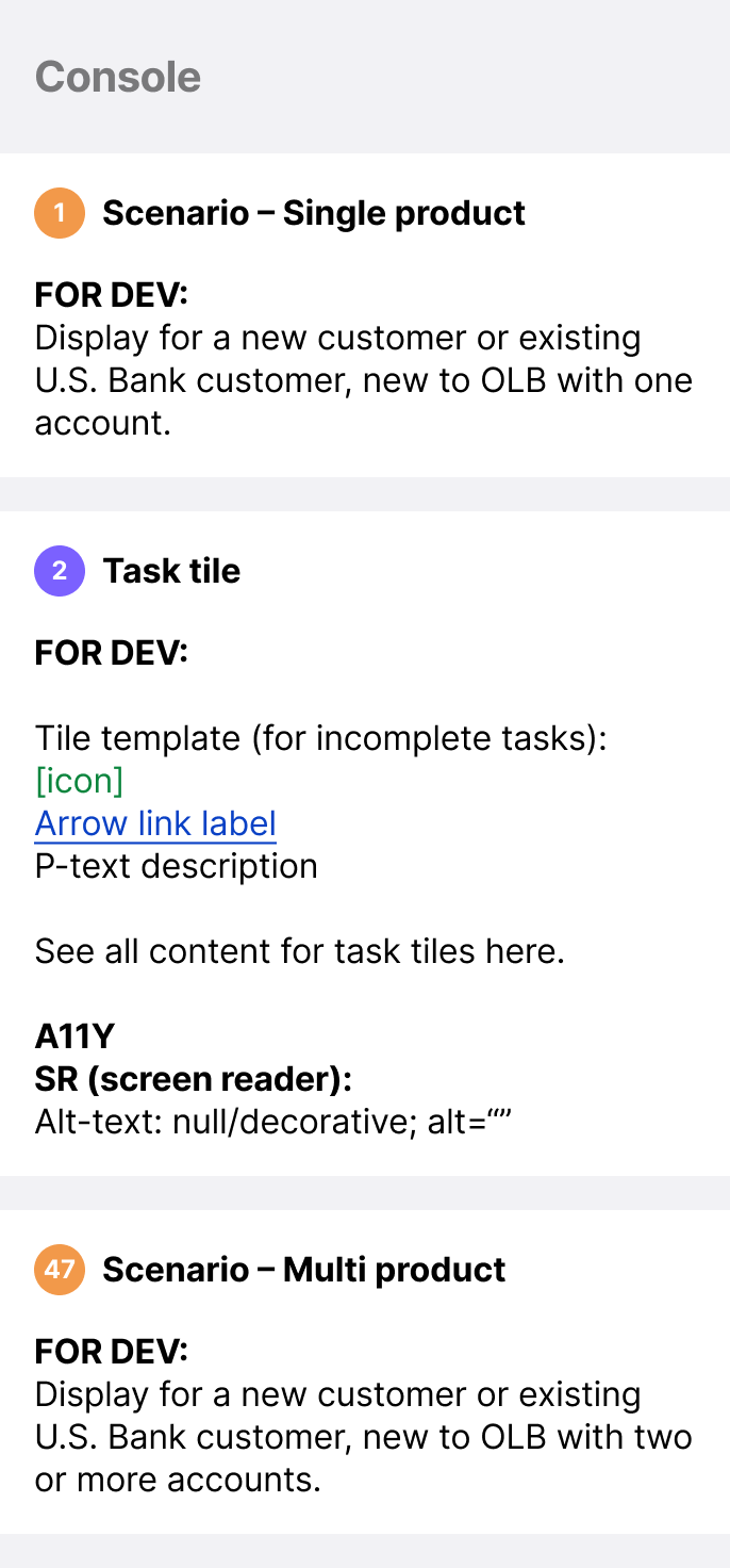
Below are the shipped designs for the console, built on Option C and refined through two more rounds of testing. The component specs document the scenarios and task tile behavior, and the mobile and desktop screens show how the experience adapts across breakpoints.
Component specs
Mobile
Desktop
Interactive Prototype
Open in Figma ↗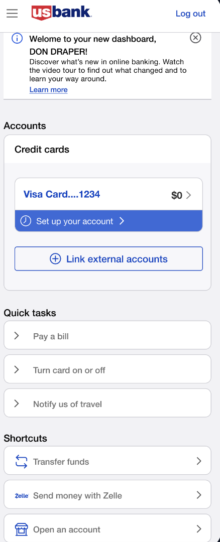
Dashboard · 1 of 6
04 / Key Decisions
The choices that shaped the outcome.
Separated the experience into a re-engagement entry point and a task completion system
Returning users turned out to be the bigger problem, so I split the design into two pieces. The dashboard widget handled getting people back in. The console handled actually finishing the work. Each piece could focus on one job instead of doing both badly.
Prioritized clarity of system feedback over reducing steps
Even after we cut steps, drop-off didn't really move. The issue wasn't volume, it was visibility. Users couldn't see what was left, so they either assumed they were done or assumed it was endless. I shifted the whole direction from "simplify the list" to "show the list clearly," which changed pretty much every decision after that.
Centralized onboarding tasks into a single, actionable console
The old fragmented setup never showed users the full picture, so I pulled every task into a single view. Now they could see what was left, what each task involved, and what was coming. If I'd had more time, I would've pushed harder on the modal-versus-full-page question.
Designed guidance and progress cues to support task completion
Users didn't just need a list, they needed reassurance. So I leaned into two things: progress they could see at a glance, and short context on why each task actually mattered. That shift took users from grudgingly checking boxes to actually engaging.
Reflection
What I took away from this.
What this reinforced
Most users aren't spending time on the dashboard. They're there to check their balance and move on. That shaped everything about how we approached the widget. It couldn't compete for attention, it had to be in the one place users were already looking. Placing it directly under the account balance wasn't just a design preference, it was the only placement that worked with how people actually use the product.
What surprised me
I expected a long task list to feel like too much. It didn't. The console shows every setup task in a grid all at once, and users were more comfortable with that than being guided through tasks one at a time. Seeing the full picture gave them a sense of control. They could decide what felt relevant right now and come back for the rest. I went into testing assuming we'd need to reduce and simplify. What users actually wanted was transparency.
What I'd push harder on
The console treats every task equally with no signal about what's time-sensitive versus what can wait. That flexibility is intentional, but looking back I'd push for a lighter prioritization layer. Not a rigid order, but enough structure to help users know where to start without taking away their sense of control.
What I'd explore next
Personalization within the console. The layout and structure are consistent across products, but a credit card customer and a checking account customer are working through different tasks. A natural next step would be introducing tabs within that same structure: one for all tasks, one for priority items, one for things they can revisit later. That would help users navigate their specific task list without changing the overall system they already know.
Approach
Research
Questions
I wanted to know why users weren't coming back, not just where they dropped off. Those questions reshaped how I thought about the whole problem and made me question what onboarding is even for.
How much do we want the user to "do" during onboarding...is it a frictionless "nothing"? Or, should we ask them to invest a little time? What's the right level for a bank?
When does onboarding begin? Does onboarding ever "end"?
How can we make it easy for people to "get back" to offers and preferences posed during onboarding? Do they have to do the work? How do we "do it for them"?
How do we build and nurture the customer relationship? What is the right balance between customer needs, discovery of the bank, and our own business goals?
How can we help the customer feel in control of the many offers, insights, alerts, and messages they'll be getting on a daily basis?
Competitive Analysis
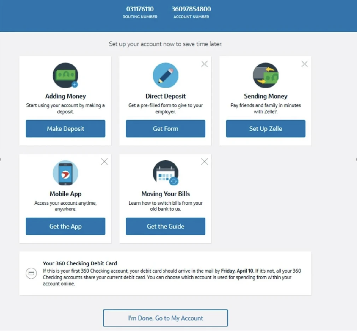
I analyzed how leading financial institutions handle post-login onboarding to spot best practices and opportunities to do something different. That surfaced an interesting tension. Every competitor I looked at treated onboarding as a single, one-time event, which meant there was no established pattern to follow. We couldn't simplify the steps, so we had to rethink what happened around them.
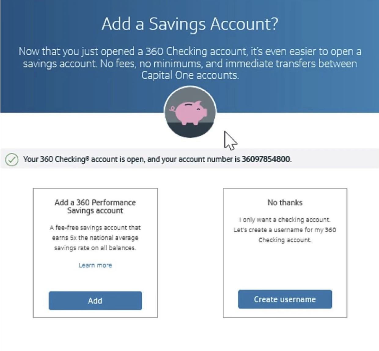
Capital One, for example, surfaces a "set up your account" screen once, right after a customer's first login. After that, it's gone. I looked at how several other banks handled this same moment and noticed a consistent pattern: most banks put the burden on users to remember what they hadn't done. That forced a trade off on us. We either had to interrupt users repeatedly, or build a system that made reentry feel natural. We chose the latter.
These screens show the same pattern across competitors. Onboarding shows up once, then vanishes. Nothing in the market gave users a way back.
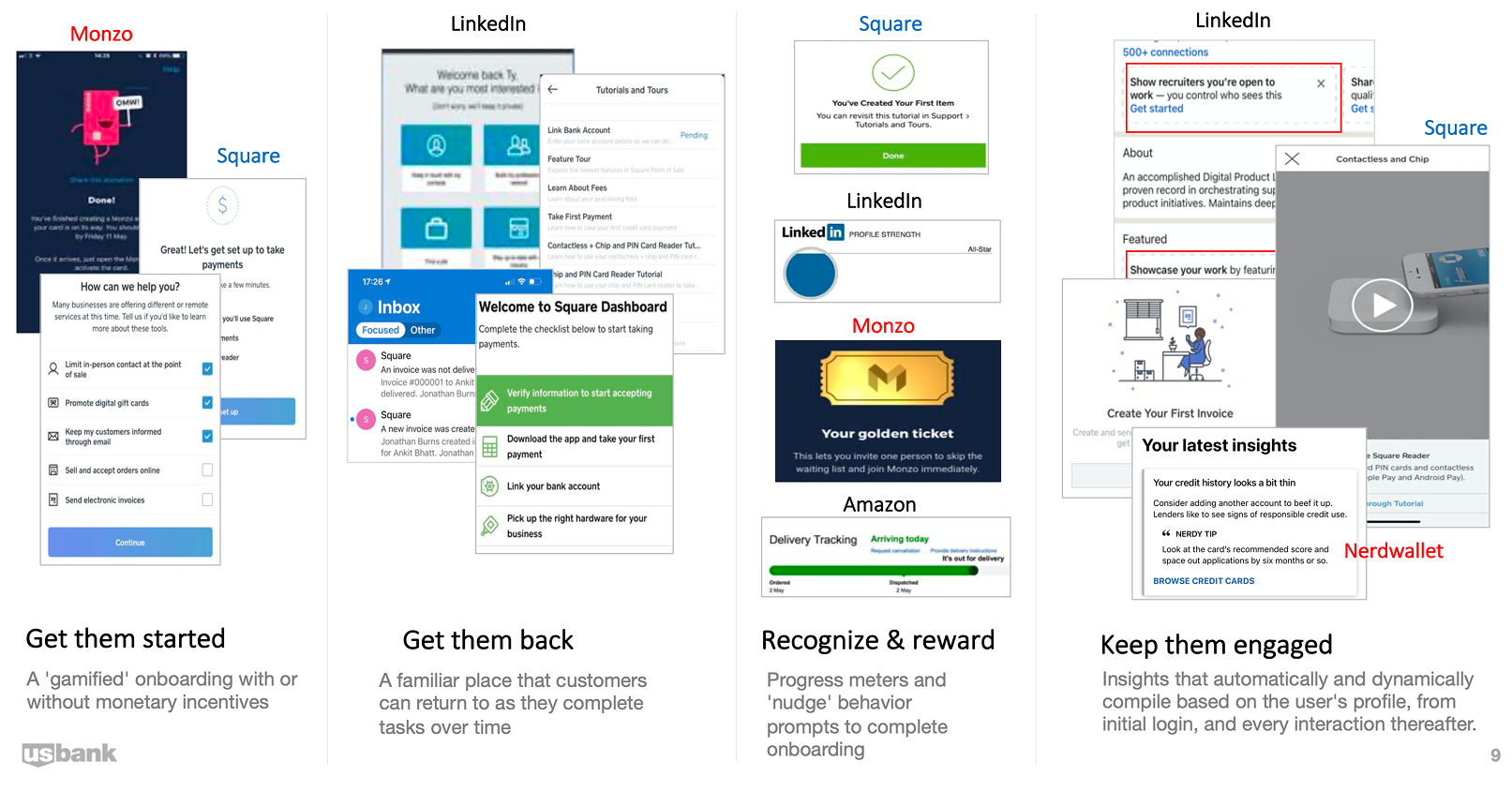
We also looked at the broader range of engagement strategies available to us, ways to bring customers back and keep them moving through setup without feeling nagged.
User Persona
To ground our design decisions in real user needs, I built a persona representing our primary target audience: new account holders who need flexibility in finishing setup on their own time.
Alex
The Career-Starter
Profile Type
Overwhelmed Newcomer
Goal
Wants to move their primary banking to U.S. Bank but is currently busy with a new job and moving apartments.
Pain Point
Alex feels pressured by "interstitial" onboarding that pops up immediately after login. They often "skip" it to check their balance quickly and then forget how to get back to those setup tasks.
Motivation
Needs a "low-pressure" way to set up features like Autopay and Paperless preferences over time, not all at once.
The Design Solution
The Dashboard Widget acts as Alex's "digital breadcrumb," allowing them to jump back into the Console whenever they have a spare 5 minutes during their first 90 days.
Extended Onboarding: The 90-Day Account Optimization Journey
This journey map illustrates how users progress through the onboarding experience over time, highlighting key touchpoints where our design interventions support their goals while addressing pain points at each stage.
Alex logs in for the first time. The Interstitial Flow introduces key digital services.
Alex activates their Physical Card but skips secondary tasks to check their balance.
Over the next few weeks, the Dashboard Widget nudges Alex to explore remaining features.
Alex enters the Console and completes Autopay, Paperless, and Digital Wallet setup.
"I want to be informed, but I'm in a rush to see my account."
"I'll do the rest later. I hope I can find these settings again."
"Oh, I still haven't set up my alerts. I'll do that now since I have a minute."
"My account is finally set up exactly how I want it. I feel in control."
High friction; user feels blocked from their primary goal (checking balance).
Risk of "The Gap," where users forget essential features once the modal is closed.
Users often feel overwhelmed by "salesy" messages that aren't personalized.
Feeling unorganized or "incomplete" if they can't see their progress.
Interstitial Micro-flow
(Information-heavy modal)
"Maybe Later" Logic
(Providing an intentional exit)
Dynamic Dashboard Widget
(Persistent, low-friction entry point)
Centralized Onboarding Console
(Task list/Accordion hub)
Result
Trust-Building Entry.
Seamless Task Continuity.
Efficient Orchestration.
Achieved Potential.
Establishes awareness of services without forcing a bottleneck.
Urgent needs are met while flagging non-urgent tasks for later.
Balances business goals with the user's daily banking routine.
User has a personalized, fully optimized banking relationship.
Wireframe
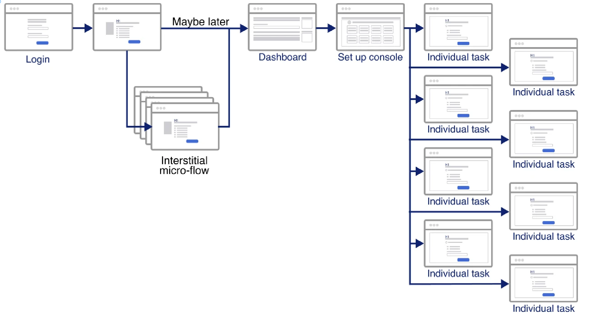
I mapped out the complete user flow to visualize how customers navigate from initial login through the onboarding console, ensuring a clear path to complete each setup task.
Design Explorations
I explored multiple approaches for widget placement and visual design to find the right balance between visibility and unobtrusiveness on the dashboard.
Every placement involved a tradeoff. Too loud and it read as an alert. Too quiet and people scrolled right past. Here are the four directions I tested and what each one was trying to protect.
Widget Entry Point Exploration
All of this came down to one question: how do you surface unfinished setup on a dashboard without nagging? Each option traded visibility against intrusiveness. Loud enough to bring people back, quiet enough not to fight with the actual banking content.

Main panel | Under account section widget
Lorem ipsum
Lorem ipsum
Widget Design Variations - Static Designs
These static variations tested hierarchy and information density. The widget had three jobs in one small card: show status, create some urgency to come back, and still feel calm next to everything else on the dashboard. Each version weighted those three differently.
Widget Design Variations - Dynamic Designs
Widget Design Variations - Hybrid Designs
Notifications Design - Use existing notification center
Fixture/NBA Banner Design
Console Explorations
Once users clicked through the widget, they needed a clear space to actually complete tasks. The central question here: should the console be a modal overlay or a full page? A modal kept users contextually close to the dashboard but constrained the layout. A full page gave more room but felt like a context switch. This forced a trade-off between perceived effort and available real estate.
High-Fidelity Prototypes
Building on the wireframes, I moved into high-fidelity prototypes for two separate decisions: where the reminder widget should live on the dashboard, and how the hub itself should be laid out. I kept them separate because they were testing different things, placement versus structure. The tradeoff was that we couldn't fully validate the end-to-end experience until both decisions were made on their own. The four options below all focus on widget placement.
High Fidelity Option 1 - Simple Design
This option was designed to minimize cognitive load. A clean, minimal widget that surfaces the re-entry prompt without competing with existing dashboard content. The trade-off was that its quietness risked being overlooked entirely.
High Fidelity Option 2 - Hybrid Design
This layout combined a progress indicator with task shortcuts, giving users a sense of where they stood while reducing the number of taps needed to start a task. The challenge was that showing both state and action in one compact widget created visual tension that was hard to resolve at smaller screen sizes.
High Fidelity Option 3 - Banner
The banner was the loudest option, hard to miss by design. The downside was that it read more like a system alert than a friendly nudge. I'd been leaning into it for the click-through potential, but testing made it clear: users didn't want anything that felt like an interruption.
High Fidelity Option 4 - Widget Under Account Section
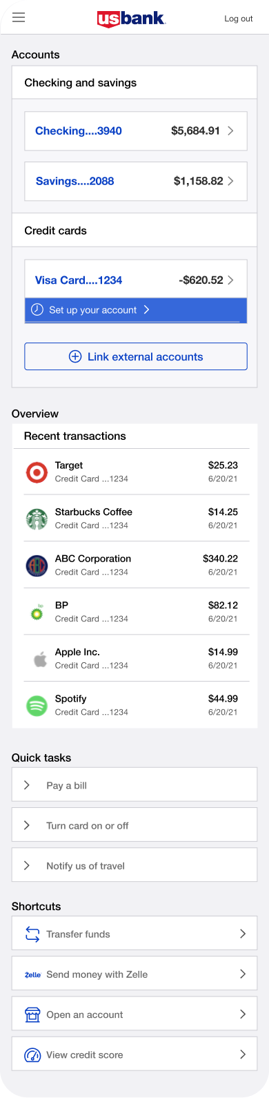
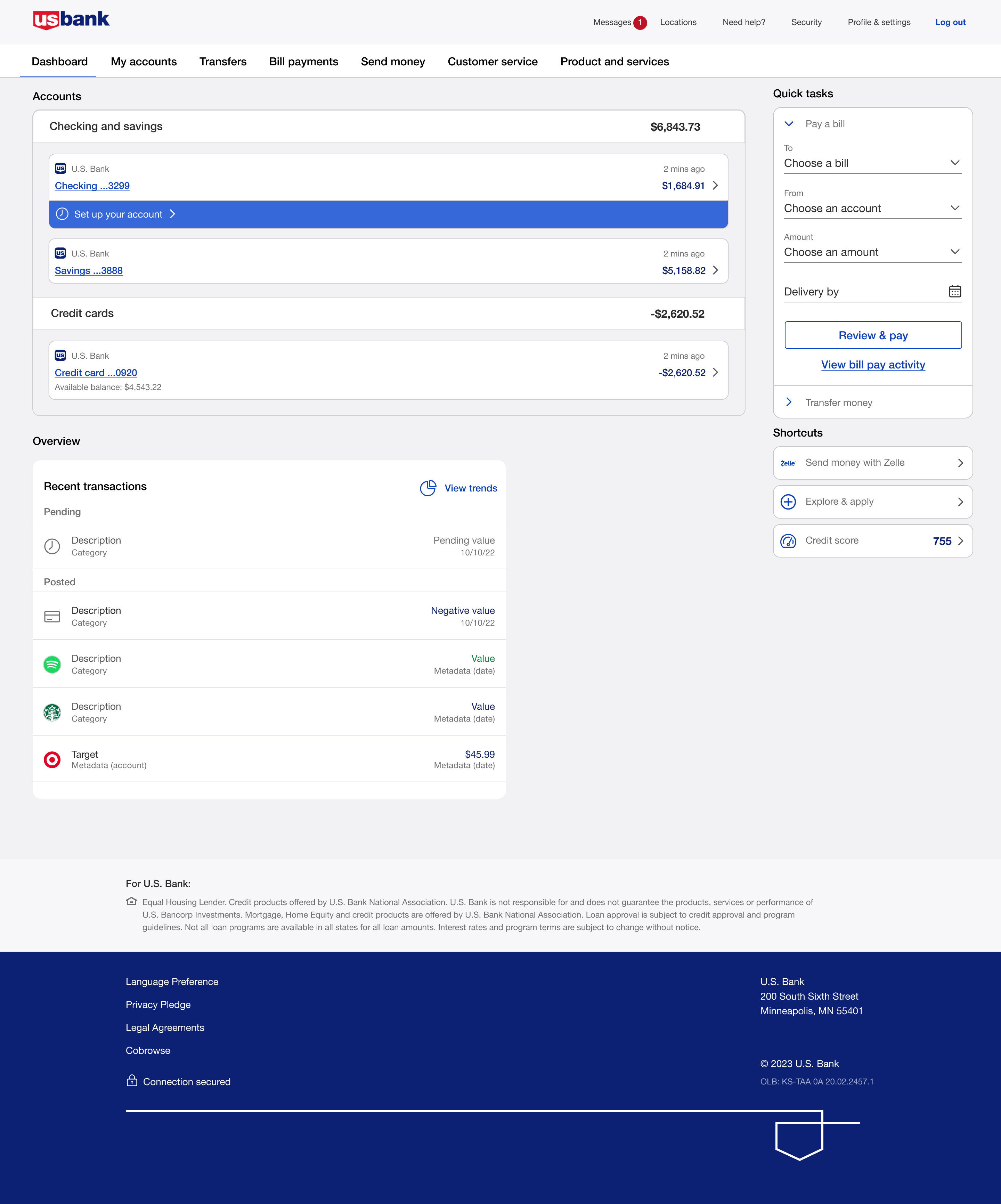
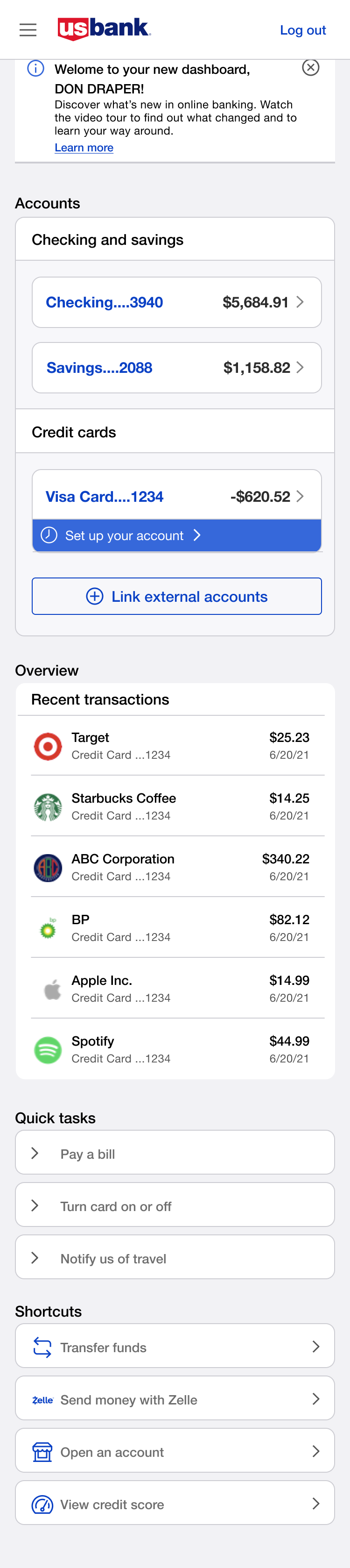
Putting the widget directly under the account summary connects the user's account state to whatever setup they still owe. It lowers the friction of getting back in by living where users are already looking, instead of asking them to go find it.
Final entry point, desktop & mobile
Option 4 won. The inline widget sitting directly under the Checking row scored highest on findability. Every participant in testing noticed it without being prompted. These are the final high-fidelity screens across breakpoints.
Desktop
Mobile
Console Options
Separately from the widget placement, I explored three layouts for the Console, the full onboarding hub users reach after clicking the reminder. To test these, I ran moderated think aloud sessions with 8 participants. Each person got the same task scenario and was asked to narrate what they were thinking as they moved through the layout. I sat in on every session and took notes on where people hesitated, what they said out loud, and what they skipped entirely.
Console Option A, Task List with Progress Ring
"
I like that I can see how far along I am. The circle makes it feel like I'm actually making progress.
- Participant 3
"
There's a lot going on on the left side. I wasn't sure which task I was supposed to do first.
- Participant 6
Console Option B, Hybrid with Progress Bar
"
The bar at the top is a nice touch, but I honestly scrolled right past it the first time.
- Participant 1
"
Having the task detail right there on the side saved me from having to go back and forth. That was helpful.
- Participant 4
Console Option C, Task Grid View
"
Oh, I can see everything at once. That's actually really helpful, I don't have to guess what's left.
- Participant 2
"
I just clicked on the one that felt most urgent to me. It was easy to navigate.
- Participant 7
"
This one felt the most like something I'd actually use. The other two felt a bit more like a chore list.
- Participant 5
Validation & Iterative Testing
After exploring widget placements and console layouts, I moved the strongest concepts into high-fidelity prototypes for usability testing. The goal was twofold: could customers find their way back to setup after skipping the interstitial, and once they got there, could they actually move through it without friction? Because these were two different problems, I tested them separately. The widget focused on re-entry. The console focused on task completion.
Testing the Widget
Across eight 45-minute sessions, one pattern was clear: people came to the dashboard to check their balance, and anything outside that motion had to earn attention rather than demand it.
The side widget got buried. Between insight cards, quick tasks, and promotions competing for space in the right rail, nobody noticed it without prompting. The banner read like an ad. Users either ignored it or felt interrupted, the opposite of the low-pressure re-entry we were designing for. The notifications area was too hidden. Users didn't associate it with account setup at all.
Option 4, placing the widget directly under the account balance row, won at 67%. It anchored setup to the account that needed it. Users noticed it immediately and without prompting, because it was already where they were looking. Getting there required more than a design decision. That space belonged to the dashboard team, and placing anything new there meant aligning across business lines. The testing data made that argument for us.
Testing the Console
Once users were inside the console, the question shifted: how do you present multiple setup tasks without overwhelming people or leaving them unsure where to start?
Console Option A presented a sidebar task list alongside a detail panel with a progress ring. Users appreciated the progress indicator, but the two column layout created confusion. There was too much happening on the left side and participants weren't sure which task they were supposed to start with.
Console Option B split the screen similarly, with tasks on one side and task detail and actions on the other. It had the same problem. The split layout meant users had to hold context in two places at once, which added cognitive load instead of reducing it.
Console Option C, the Task Grid View, was the winner. Users said seeing everything at once helped them feel in control. They could scan the full list, pick what felt right, and come back for the rest. No guessing what was left. The grid gave them enough structure to navigate on their own terms without feeling drip fed through a flow someone else decided for them.
What Surprised Us
We assumed a long task list would feel overwhelming. It didn't. The volume wasn't the problem. The lack of clarity about where to start was. Option C solved that not by reducing what was shown, but by giving users the full picture in a format they could orient themselves within.