US Bank, Onboarding First Login
Outcomes
Driving Engagement by Removing Onboarding Friction
The business case was clear: improving the first-login experience directly tied to activation rates, product adoption, and revenue. In banking, the first 90 days are critical — users who don't complete key setup tasks are significantly more likely to churn.
+18%
onboarding task completion
More first-login users completed at least one setup activity within 30 days compared to the baseline period before the experience launched.
+12%
digital feature activation
Increase in customers setting up alerts, paperless, and digital wallet within 60 days — key indicators of long-term engagement.
−11%
90-day churn
Customers who engaged with the new onboarding showed meaningfully lower churn in the critical first 90 days after account opening.
The Problem
New users weren't completing key setup tasks after opening an account, which led to lower feature adoption and higher churn in the critical first 90 days.
My Role
Owned design end to end for the first login experience, from research synthesis through prototyping to engineering handoff. Partnered with an XA who facilitated stakeholder alignment and decisions, a content strategist, and UX research support throughout.
Key Insight
Users need clear direction without feeling overwhelmed. The ability to skip tasks and return later kept them in control of their own pace.
What I led
- ▪Led research synthesis across card sort sessions and moderated Userzoom interviews
- ▪Built out all 4 design concepts, sequential, waterfall, gamified, quiz, into testable prototypes based on directions the team aligned on together.
- ▪Facilitated design thinking workshops and stakeholder alignment sessions
- ▪Drove the recommended direction from concept to high-fidelity prototype and engineering handoff
Team
4 Experience Designers · 2 XA · 1 Researcher · 2 Content Strategists · 2 PMs · 1 A11Y Consultant · dedicated Engineering pod
Scale
Millions of U.S. Bank credit card and checking account customers
The Solution
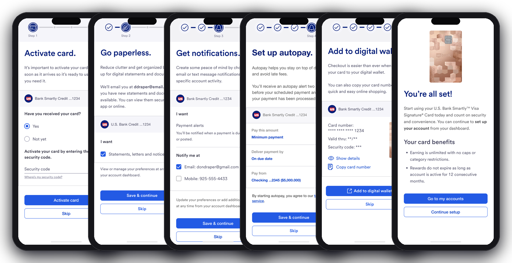
Create a new user informed onboarding experience that's welcoming, intuitive, personalized and works as a "friendly financial partner."
Instead of sending new customers into this new world alone, the experience provides a guided concierge service. The key concept is surfacing important items that allow customers to customize their product, at the right moment, in a way that feels helpful rather than overwhelming.
Personalization
Full Activity Menu Upfront
Customers see all available setup activities on the welcome screen before committing to anything, giving them the full picture and letting them choose where to start.
Task Design
Recommended Activities
A curated task list surfacing the most important setup steps first — alerts, digital wallet, paperless, and more — in a sequential, low-pressure flow.
Engagement
Persistent Activity Model
Setup activities persist after first login so customers can complete them at their own pace — no time pressure, no weekly schedule, just a clear path back in.
Interactive Prototype
Open in Figma ↗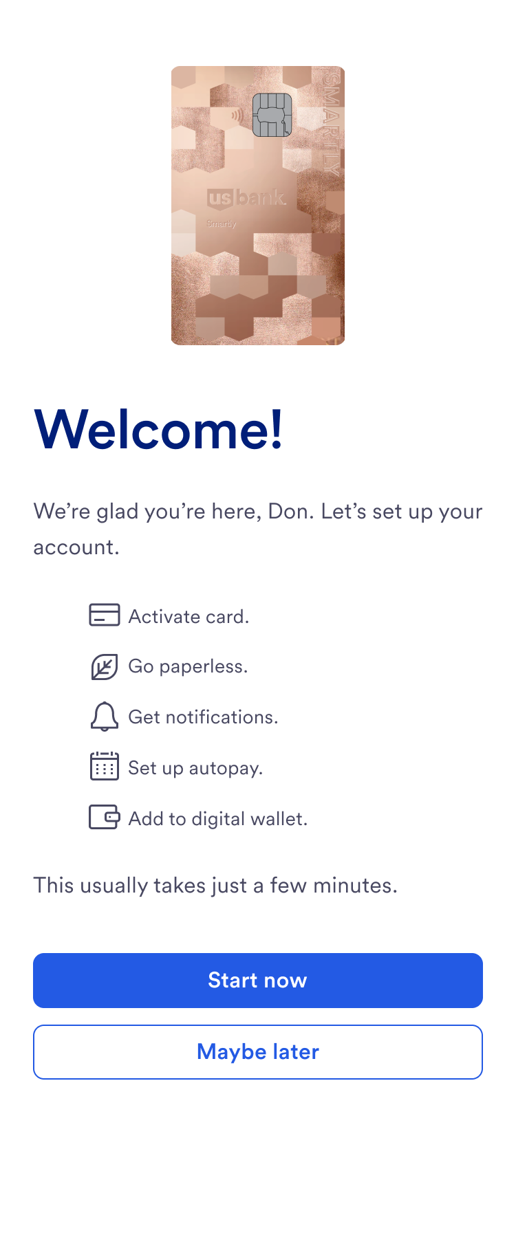
Welcome · 1 of 7 — tap the primary button or a dot to navigate
Design Principles
The Rules of the Road
To translate our research into a consistent experience, I established three core design principles:
Principle 1
Match Interaction to Value
High-intensity interactions, such as pop-ups, are reserved strictly for mandatory tasks.
Principle 2
The 3-Reminder Rule
Critical setup tasks include reminders, but these are capped at three to prevent user fatigue.
Principle 3
Provide an 'Exit'
Every screen includes a clear "Dismiss" or "Do Later" option to respect user autonomy and the desire for self-discovery.
Final Design
Where the Research Led Us
Across all four concepts, a few consistent expectations surfaced. Customers were fine being prompted to complete mandatory setup tasks and expected to be reminded a few times — that felt standard. But for optional items, they wanted to be left alone. They trusted themselves to explore and didn't want to be guided through activities they hadn't asked for. They also needed clarity on what "done" actually looked like: what's required, what's extra, and when the account is considered set up.
That's what shaped the final design. A sequential structure for core setup, full visibility into all available activities from the start, and clear escape hatches throughout. The experience is direct without feeling like an obligation.
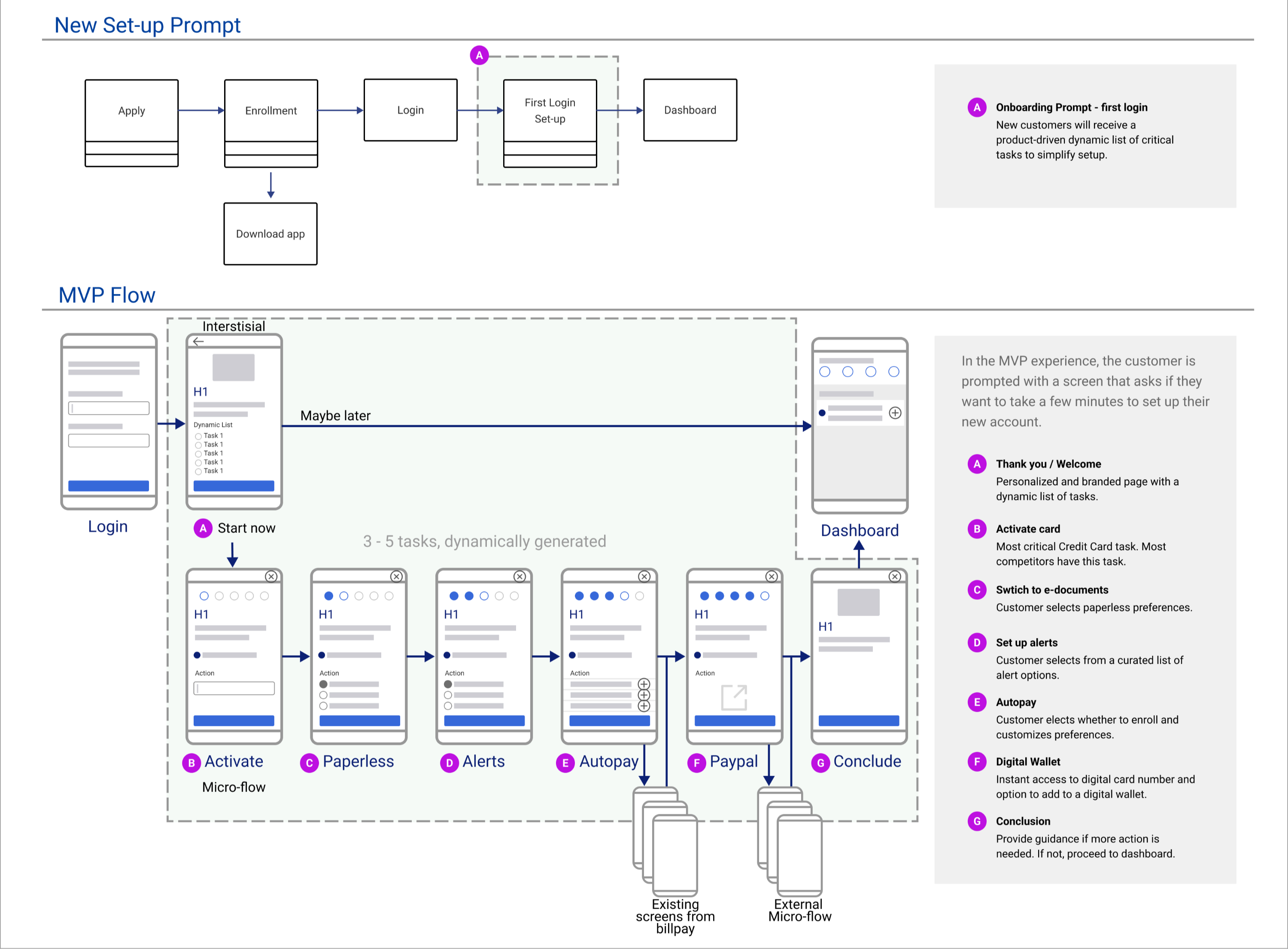
Onboarding Flow
The first-login experience at a glance
The overall structure of the first-login experience, from welcome screen through to the persistent activity model that keeps customers engaged after day one.
Challenge + Process
Designing First Login Onboarding: Guiding Users from Day One
First login onboarding introduces key setup tasks immediately after users sign in for the first time. Without early guidance, users missed critical setup steps — leading to incomplete onboarding and reduced product adoption. This experience represents the first stage of a broader onboarding system, where users are introduced to tasks that can be completed immediately or continued later.
Key Insight
Users need clear direction at first login, but not all tasks should be completed in a single session.
The Tension
Introducing too many tasks upfront risks overwhelming users, while limiting tasks reduces awareness and completion.
Approach
Designed an interstitial experience that:
- ▪Introduces high-priority onboarding tasks
- ▪Allows users to complete key actions immediately
- ▪Enables users to skip and continue later without losing visibility
- ▪Prioritized essential tasks while deferring others
- ▪Established a foundation for continued onboarding beyond first login
Ideation
Four Design Concepts
Four design concepts explored before converging on the recommended direction.
Each concept represented a different theory about how much structure users needed. The challenge was that more structure meant more friction, and we were still debating internally how many tasks to surface at once. Testing four radically different approaches was the only way to stop guessing.
Design 1
3 featured activities in sequence order with ability to skip, simple save & continue to proceed.
This layout was designed to reduce decision fatigue by limiting choices — users saw one task at a time. The risk was that it felt rigid. Testing showed users wanted to know what was coming before committing, which this design didn't allow.
Welcome
Set up your account in a few quick steps to get the most from US Bank on day one.
Activity One
Stay on top of your finances with real-time alerts for purchases, low balances, and unusual activity.
Activity Two
Go paperless to access your statements anytime and reduce unwanted mail.
Activity Three
Add your card to Apple Pay or Google Pay for fast, secure payments anywhere you go.
All set! Go to your dashboard.
You're all set. Your setup tasks are saved — pick up where you left off any time.
Design 2
Waterfall approach, continuous activities, 3 at a time, reloads more activities, weekly goal / timeline.
The weekly goal model was built to create a habit loop — small wins each week, not one overwhelming session. The problem: users didn't come back on a weekly schedule. The cadence felt arbitrary, and the reloading queue created confusion about how many tasks actually remained.
Let's get started!
Let's get your new account ready in a few quick steps.
This Week's Activities
0/3 COMPLETE
Let's get started!
Let's get your new account ready in a few quick steps.
This Week's Activities
1/3 COMPLETE
Welcome back!
Now that you've set up the basics, let's take your account to the next level.
This Week's Activities
0/3 COMPLETE
Welcome back!
Now that you've set up the basics, let's take your account to the next level.
This Week's Activities
2/3 COMPLETE
Design 3
Gamified approach, progress bar across 5 milestones, weekly activity goal, completed task accordion.
Gamification tested well in concept — users liked the visual progress. But it introduced a problem: when users skipped tasks, the progress bar felt misleading. It also added visual complexity that distracted from the actual tasks. This forced us to separate "progress visualization" from "task completion" as distinct design problems.
Let's get started!
Your weekly tasks
0/5 COMPLETE
Almost there!
Your weekly tasks
4/5 COMPLETE
▼ Completed Tasks
Start making the most of your money!
Your weekly tasks
0/5 COMPLETE
Design 4
Quiz-style experience, 4 goal options, 3 recommended activities, weekly progress, list format.
This concept was designed to personalize the experience by anchoring tasks to what the user actually cared about. The quiz surfaced goal-based recommendations rather than a generic task list. It tested best because users felt the experience was relevant to them, not just another generic checklist. This insight shaped the final recommended direction.
It's time to make the most of your money!
Name, congratulations on your new account. Don't forget about yourself as we can help you make the most of your new account.
What are your financial goals?
To help you get control of spending, we recommend:
Start to take control of your spending today!
Research Findings
What We Learned
Research findings across each design concept — what worked, what didn't, and what shaped the final direction.
Design 1, Sequential — Viewed Most Favorably
Felt familiar and expected
Participants assumed the step-by-step tasks were mandatory, and that wasn't a bad thing. It felt like the bank was guiding them through something important.
"This isn't a bad thing at all." (P8)
"Those first couple steps, I think they're going to guide you through." (P6)
'Maybe later' and 'Skip' landed well
Users admitted they often ignore these prompts in apps, but having the option made them feel in control without pressure.
"I can do the first one and come back another day." (P5)
"If I'm in a rush, I would exit and move on." (P10)
Seeing all choices upfront was a plus
Transparency about what's ahead on the welcome screen reduced anxiety and set expectations before committing to anything.
Design 2, Waterfall — Felt Prescriptive and Never-Ending
Liked the chunking, but wanted to jump ahead
Breaking tasks into smaller groups felt helpful in theory, but participants wanted the ability to skip to a specific step rather than go in order.
"I like it being broken down, but is there an option to go to step 4, could I?" (P5)
Continuous tasks felt inappropriate for optional items
Participants expected a continuous flow only for things they had to do. Optional activities in that format felt out of place, and the value wasn't clear.
"Like how many steps are there?" (P5)
Felt like overkill, micro-manage-y
The ongoing, week-by-week structure felt excessive for a banking product. Participants expected the setup process to have a clear end, not keep going.
"It is a checking account; it shouldn't be this crazy." (P7)
Caused unease and lack of closure
The waterfall model never felt like it was finished. Participants were left wondering what came next, and whether there was an end at all.
Design 3, Waterfall 2 — Felt Restrictive
5 tasks at a time felt more manageable
Limiting to 5 activities per week was a clear improvement over Design 2's longer list. Participants appreciated the smaller scope even if the format still had issues.
"Just 5 things at a time, makes it feel less overwhelming." (P4)
Positive reaction to 'most of your money', but timing felt off
Participants liked the idea of being nudged to make the most of their account. But they expected that to come after the basics were set up, not as part of the first login experience.
Seen as something that should happen later., P8
Felt restrictive, participants wanted freedom to choose
The locked, sequential structure felt like the bank was controlling what they could do and when. Participants wanted to see all options and decide for themselves.
"Wants option to see other things I can do." (P4)
"You have to do these things first before you can do anything else? I want to have freedom to do the things I want to do." (P4)
Weekly cadence and no skip option were dealbreakers
The bank controlling the timing felt off — participants didn't want to be on a schedule for optional activities. A skip, dismiss, or do-later option was expected but missing.
"I don't love the weekly tasks." (P4)
Design 4, Quiz Approach — Did Not Feel Appropriate for Onboarding
The personalized content gave a friendly vibe
Participants reacted warmly to the goal-setting approach — it felt approachable and felt tailored to them from the start. The tone landed well even when the format didn't.
"Very approachable, and I like that." (P8)
"I like that it's personalized from the beginning." (P4)
Didn't feel like the right moment for a quiz
Participants expected the basic account setup to have already happened before seeing a goal-selection screen. The quiz felt like it belonged later in the relationship, not on first login.
- ▪Expected 'first things' (alerts, direct deposit) to come first
- ▪Felt more like a complement to onboarding than a starting point
Created a sense of missing out
Choosing one goal made participants worry they'd lose access to features tied to other goals. The selection felt permanent even when it wasn't.
"If I chose a different goal, would I miss out on a feature?" (P4)
Felt unnecessary for a checking account
The quiz format felt better suited to financial planning tools or advisory experiences, not a standard checking account setup. Participants didn't want to answer a lot of questions just to get started.
"I don't want to play 20 questions with an app." (P7)
Research
Research Methodology
Because there was no existing experience to evaluate, we started from scratch — using a multi-phase research approach to understand customer expectations before a single screen was designed.
This became challenging early on: we had no baseline to measure against, and stakeholders held strong opinions about what customers wanted. The research gave us ground to stand on when those conversations got difficult.
Participants
10 non-customers
- ▪Digital-first users who use apps as their primary way to access and open bank accounts
- ▪Mix of young mass, young affluent, midlife mass, and midlife affluent segments
- ▪Split between recent account openers (last 6 months) and those who haven't opened an account in 5+ years
Method
Moderated interviews on Userzoom
- ▪Screen controlled by moderator throughout each session
- ▪Split 50/50 between credit card and checking account openers
- ▪Each participant viewed 2 of the 4 design wireframes
Card Sort Activities
Series of card sorts
- Open card sort — participants grouped cards into categories that made sense to them and named the groups
- Sorted groupings by importance
- Sorted groupings by expected timing
Competitor Analysis
How other banks handle first login
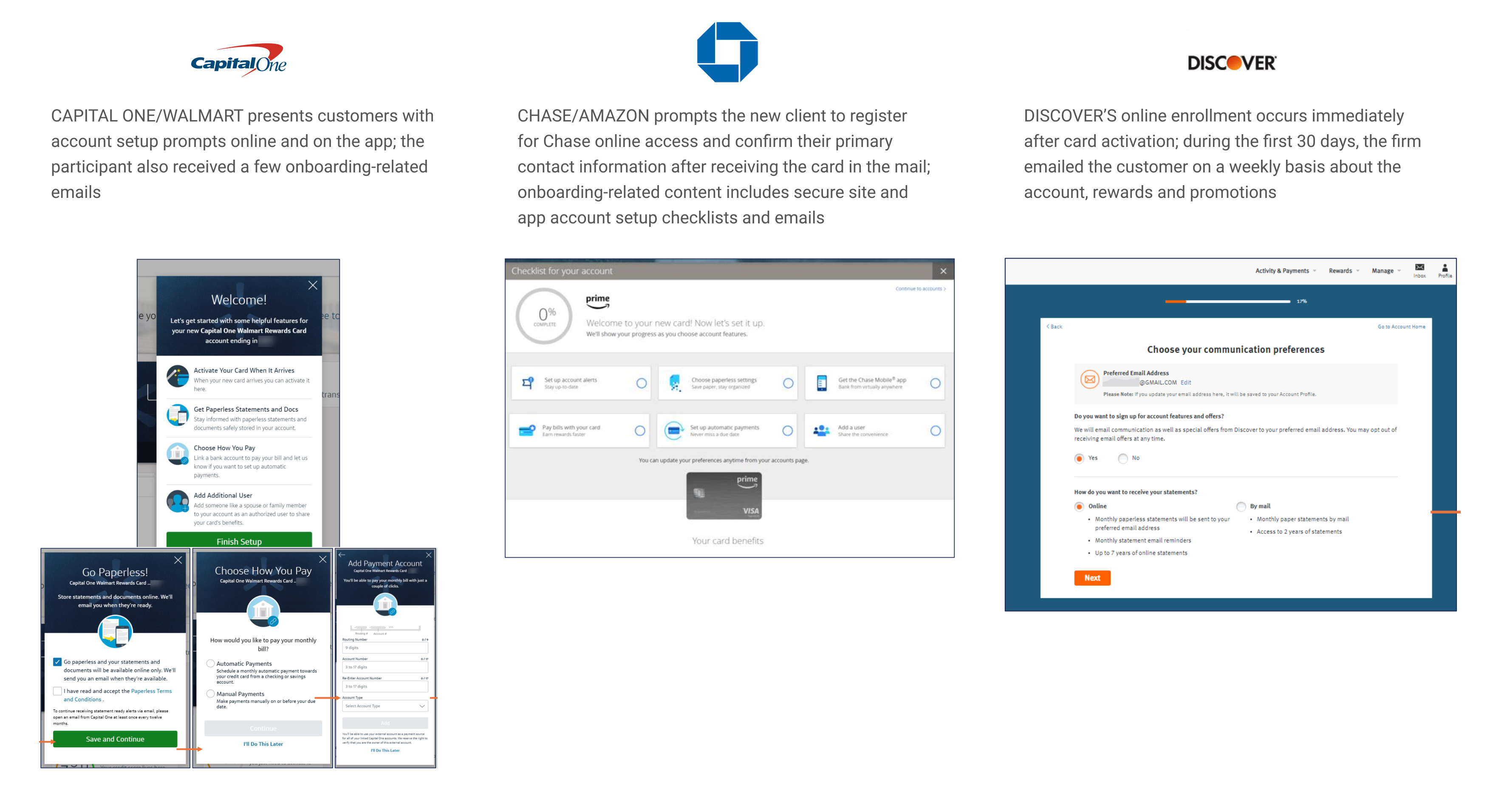
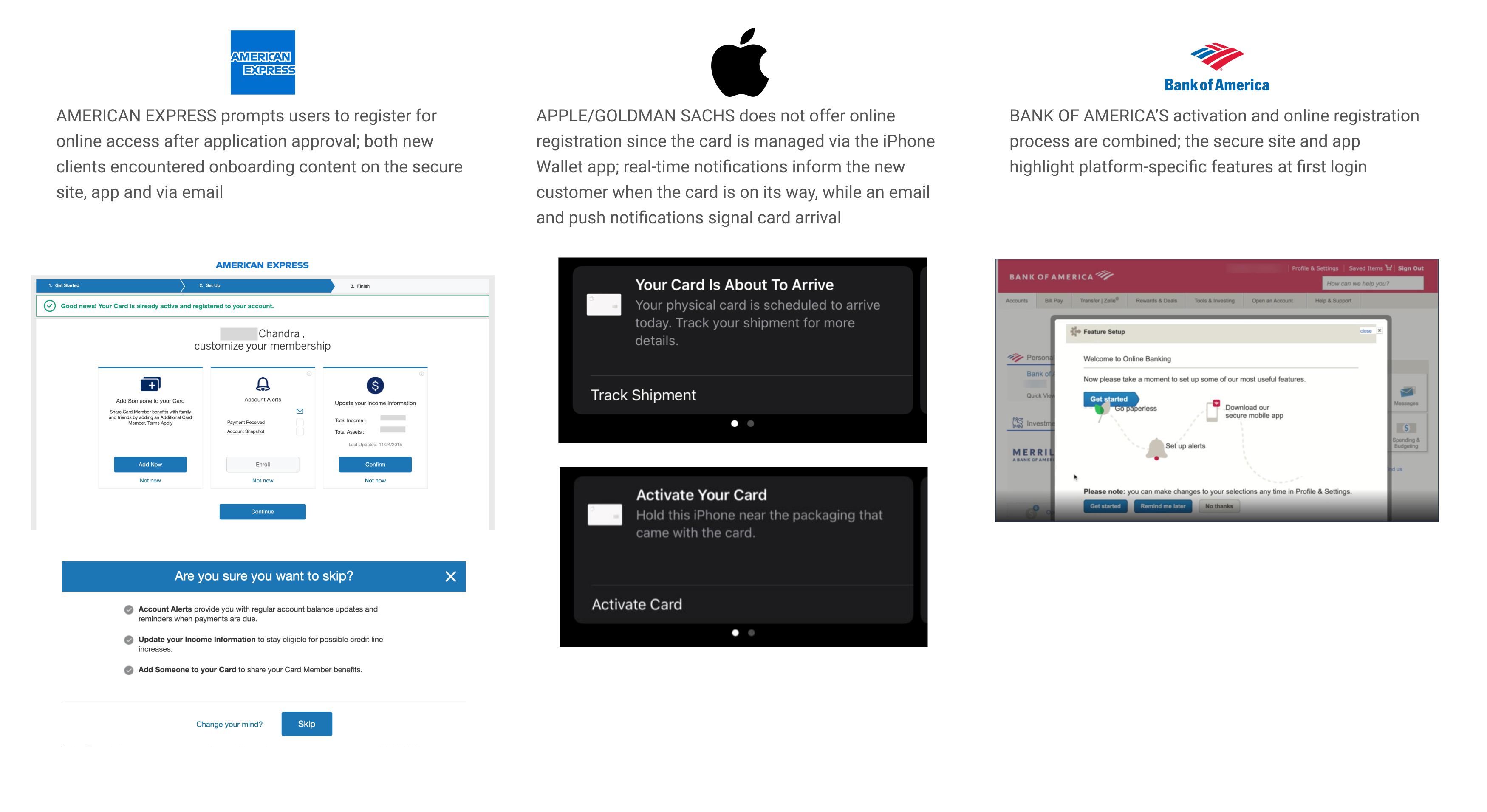
How other banks and financial apps handle the first-login experience.
Most competitors either buried onboarding inside settings or front-loaded too many tasks before the user even understood the product. We initially tried to follow some of those patterns, but testing showed users felt overwhelmed or confused about what was actually required versus optional. That forced us to rethink the sequencing and tone.
Best in Class
Patterns that informed the direction
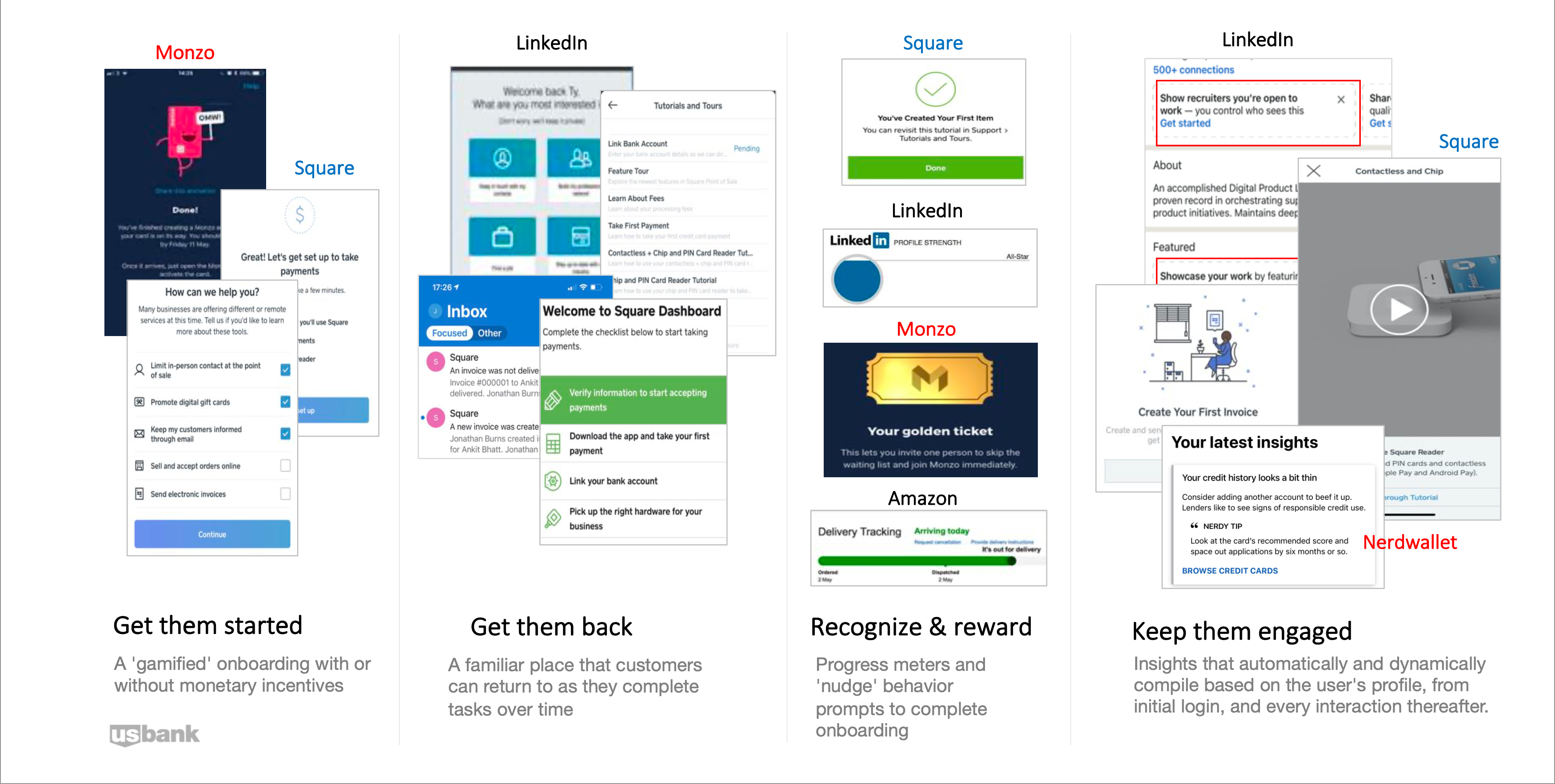
Patterns and benchmarks that informed the recommended design direction.
The clearest signal from this analysis: the best experiences didn't ask users to complete everything upfront. They introduced tasks progressively, gave users control over the order, and made it easy to come back later. That became the design principle we kept returning to.
Personas
User Personas
Six personas built from interviews and surveys to represent the range of US Bank customers.

Connie, 45
Income: $31k · Assets: <$10k
Assembler, divorced with 3 kids. Friendly, hopeful, sincere. Overworked.
Goals
- ▪Build emergency fund
- ▪Dream vacation to Europe
- ▪Build a tiny house and travel in retirement

Jeff, 43
Income: $162k · Assets: $430k
Tech Director, married with 2 kids. Spontaneous, energetic, driven.
Goals
- ▪Save for my children's future
- ▪Pay off credit card and mortgage debt

Carlos, 39
Income: $41k · Assets: <$10k
Cement Mason, married with 3 kids. Determined, persevering, hopeful.
Goals
- ▪Family vacation to Disneyland
- ▪Pay down house and credit card debt
- ▪Leave something behind for my kids

Leslie, 32
Income: $56k · Assets: $18k
Salon Owner, single. Aspiring, assertive, skeptical, entrepreneurial.
Goals
- ▪Grow the business
- ▪Purchase a home
- ▪Build a $1 million portfolio

Carol, 76
Income: $40k · Assets: $645k
Retired Dental Hygienist, widowed. Frugal, caring, anxious.
Goals
- ▪Ensure costs are covered through end of life
- ▪Avoid unexpected financial drains
- ▪Leave a legacy for children and grandchildren

Aliyah, 33
Income: $53k · Assets: $18k
Health Information Manager. Caring, pragmatic, family oriented.
Goals
- ▪Pay down debt and increase disposable income
- ▪Purchase the house I want
- ▪Build a greater sense of independence
Accessibility
Built with A11Y from the start
Our dedicated accessibility consultant was embedded throughout the project, not brought in at the end. That early involvement made a meaningful difference in what shipped.
Touch target sizing
All interactive elements, including "Skip" and "Dismiss" CTAs, met minimum touch target requirements to support motor accessibility.
Color contrast
Text and icon contrast ratios were validated at every screen state, including the interstitial overlays and progress indicators.
Screen reader support
Activity cards and navigation flow were reviewed for logical reading order and meaningful label hierarchy for assistive technology users.
No time pressure
The onboarding interstitial never auto-dismisses. Customers can read through all the available activities, decide what to start with, and choose to skip or come back later — entirely on their own time. This was especially important for users who are anxious about making the wrong choice at account setup.
Part of a connected system
This experience is Part 1 of a two-stage onboarding system. It continues through Extended Onboarding, where users can return and complete remaining tasks at their own pace.